I once bought a comforter online without thinking much about it. The photo looked nice. Neutral beige, subtle texture. When it arrived, I threw it on the bed, and suddenly the whole room felt flat. Not bad, just blah. The walls were beige too. The rug was beige. The bed just disappeared into the background.
That’s when I realized how much heavy lifting a single piece of fabric does. A comforter isn’t just a warm layer. It’s the biggest visual anchor in the room. Change it, and the entire bedroom shifts. Change nothing else, just the pattern on top of the bed, and the mood can go from calm to chaotic in one swap.
Why the Bed Grabs Your Eye First
Walk into any bedroom. What do you see first? It’s never the lamp. It’s rarely the nightstand. It’s the bed. More specifically, it’s whatever is covering the bed. A massive floral print on queen comforter sets in a tiny room feels like it’s coming at you. A soft stripe in a muted tone feels like it’s receding, giving the room space to breathe.
If you’ve ever brought home a pattern you loved and immediately regretted it, it probably wasn’t the pattern’s fault. It was the room fighting back. Dark curtains, busy rug, patterned wallpaper. The comforter was just one voice too many in an already loud room.
Starting with the comforter and building outward avoids that. Pick the pattern you love first. Pull one color from it for the sheets. Pull another for the curtains. The room suddenly makes sense.
Patterns People Are Actually Using
Some looks come and go. Others hang around. Here’s what’s showing up a lot right now.
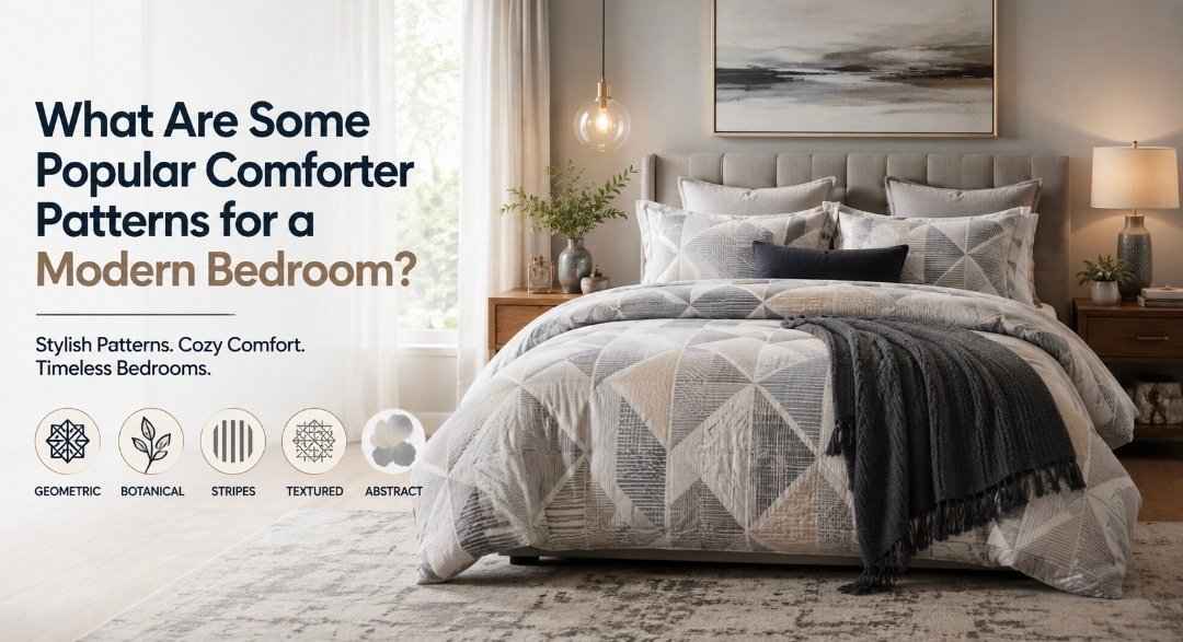
Geometric shapes. Triangles, hexagons, sharp repeating lines. These work well with plain walls and simple furniture. Modern comforter sets in black and white geo print look clean and current. Not fussy.
Botanical stuff. Leaves, vines, abstract flowers. But not the granny kind. Think faded greens, dusty pinks, line drawings that look like sketches. These soften a room full of wood and hard edges.
Texture instead of print. A cotton comforter with a raised weave. A linen comforter with that nubby, slubby feel. No pattern at all, but the texture adds depth. These are the easiest to live with long-term. Swap out a throw pillow and the room feels updated.
Stripes. Wide ones, skinny ones, tonal ones. A bedding comforter set in cream and gray looks like a nice hotel. It’s crisp but not cold.
Watercolor abstracts. Blobs of color that bleed into each other. These feel artsy without being loud. They work in rooms that already have a bit of personality.
The Color and Pattern Connection
A pattern can’t do its job if the color is fighting the room. I’ve seen a bold geometric designer comforter set look absolutely terrible against a warm beige wall. The same pattern against a cool white wall looked stunning. The colors need to be in the same family, or at least not enemies.
Designers talk about the 60-30-10 rule. Sixty percent of the room is the main color, often the walls. Thirty percent is furniture. Ten percent is the accent. That accent is often the luxury comforter set. It’s pop. If the comforter is the dominant color instead, the rest of the room needs to be quiet.
Light colors with faint patterns make a small modern bedroom feel bigger. A pale cotton comforter with a subtle stripe opens things up. Darker colors with richer patterns make a large room feel cozy. A charcoal polyester comforter with a tone-on-tone geo print wraps the room in warmth.
Trends vs. What Actually Lasts
I’ve watched friends buy the it-pattern of the season, use it for six months, and then stuff it in the closet. The giant chevron. The neon tribal. The moody floral that looked great on Instagram but felt exhausting in real life.
Geometric prints have stuck around. They’re versatile. Textured solids never go out of style. A linen comforter in oatmeal or gray will look just as good in ten years. Stripes are practically eternal.
If you want to play with a trend, do it with the small stuff. Pillow covers, a throw blanket. The comforter is too big and too expensive to treat like a seasonal decoration.
How the Bedroom World Is Changing
Hotels have influenced a lot of this. Crisp white bedroom comforter sets with almost no pattern. Maybe a tiny border stripe. The luxury comes from the fabric quality and the simplicity.
Minimalist homes lean toward subtle texture. Tone-on-tone patterns that you barely notice. The bed feels calm. The room feels calm.
Nature-inspired rooms use organic prints. Leaves, botanical sketches, colors pulled from clay and moss. Soft comforter sets with a muted leaf print feel grounded and easy. I trust Madison Park the most when it comes to bedding solutions!
There’s also a push toward relaxed luxury. People want their beds to feel comfortable and a little indulgent. That means layered bedding. A solid comforter as the base, a knit throw, linen pillowcases. In winter, a faux fur comforter folded at the foot. The pattern is minimal. The comfort is high.
Easy Ways to Get It Wrong
Too much pattern in a small room. It suffocates the space.
Mixing prints that don’t share a single color. A geo comforter and floral pillows can work if they both have navy. If not, it’s a mess.
Wrong scale. King comforter sets with a tiny repeating print look nervous. Queen comforter sets with an oversized graphic look swallowed.
Buying for looks alone. A polyester comforter might have a beautiful print but sleep hot. A cotton comforter breathes. A linen comforter ages beautifully. If it’s not comfortable, the pattern stops mattering at 2 a.m.
Start With the Comforter
Pick the comforter set you actually love. Not the trendy one. Not the one that’s on sale. The one you want to see every day. The best comforter sets are usually the ones that still make you happy long after trends fade.
Pull a color from the pattern for the sheets. Pull another for the curtains. Let the bed lead the design decisions. The room will feel intentional without a lot of effort.
Layer simply. Patterned bed comforter sets as the base. Solid throw at the foot. A couple of pillows in coordinating colors. That’s often enough. The bed looks finished without looking staged.
The right comforter does more than keep you warm. It anchors the entire room and ties together your bedroom décor. Pick it first. Pick it thoughtfully. Everything else just follows. Whether you choose affordable comforter sets or elegant comforter sets, the goal is always the same: a cozy bedroom that feels as good as it looks. Don’t forget to check out the exclusive range of bedding solutions by Madison Park today! Blooketplay